MightyChicken

Menu App for Food Truck - course project

Mighty Chicken is a fictional fried chicken business which currently 2 locations: one restaurant and one food truck. They offer popular flavours or fried chicken as well as sandwiches and sides. They want an app where people can directly order from them online.

View prototype

Project impact:

Based on user feedback, the design is easy to use and intuitive. Through research and usability studies, we are able to make the ordering journey on the app quick and simple.

“I’ll be surprised if anyone has issues with it. It is very intuitive.”
- Participant B

What I learned:

The importance of usability study and how much impact they can have on good design. I was amazed at what I was able to learn from study participants and certain aspects that I have not considered before.

Project Overview

The problem:

People often find online menus confusing and hard to customize. This deters them from ordering online.

Date:

June 2022 to Sept 2022

The goal:

Design an app that allows customers to easily order online and pickup their food.

Role:

UX researcher and ux designer

Tools:

  • Paper notebooks
  • Google Suite
  • Figma
  • Discord

Responsibilities:

  • Conduction research
  • Brainstorm on paper and digitally
  • Paper and digital wireframing
  • Low and high-fidelity prototyping
  • Testing prototypes
  • Conducting usability studies
  • Accounting for accessibility
  • Iterating on designs

Discovery

Research summary:

I conducted interviews with 5 different people who have ordered food online at least once 1 month in the last year. A primary user group identified through research was working adults who don’t want to cook after a busy day of work. This makes sense for the customer base of MightyChicken, but research revealed another group of users who wants to try new food and would like a clear simple way to order as a first time user. Both groups value clear item images, good descriptions and clear pricing.

Persona 1: Daniel

Daniel is a busy professional who needs easy ways to customize their orders because he wants to order food tailored to this tastes.

Persona 2: Sandra

Sandra is an international student who wants to see clear images and pricing to make sure she is ordering the right thing.

First iteration

Paper sketches

  • Identify key pages like home, menu, checkout, ect.
  • Identify the important features needed in these pages like navigation, image placeholders, buttons and text.
  • Create multiple version of each of these key pages.
  • Focus on easy ordering process as well as easy ways to customize items.
  • Image shows 5 version of signup, home, menu, item details and checkout page.

Low-fidelity wireframes

Homepage

  1. Easy to access language settings
  2. Pickup location and time after ordering as first thing on the page
  3. Engaging section for new customers to browse popular items
  4. Intuitive navigation in the footer of all important pages

Item Details

  1. Image slideshow of the item to give people clear indication of the food
  2. Customization size of items like chicken, sides and drinks
  3. Customization of ingredients for sandwiches and adding sauces
  4. Subtotal of item along with any customization charges on the add to cart button

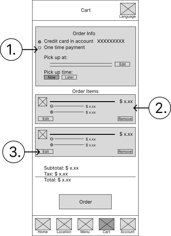
Cart page

  1. Card payment details, ordering info and pickup options at the top
  2. Summary of order
  3. Allow users to go back and edit order

Homepage

  1. Easy to access language settings
  2. Pickup location and time after ordering as first thing on the page
  3. Engaging section for new customers to browse popular items
  4. Intuitive navigation in the footer of all important pages

Item details

  1. Image slideshow of the item to give people clear indication of the food
  2. Customization size of items like chicken, sides and drinks
  3. Customization of ingredients for sandwiches and adding sauces
  4. Subtotal of item along with any customization charges on the add to cart button

Cart page

  1. Card payment details, ordering info and pickup options at the top
  2. Summary of order
  3. Allow users to go back and edit order

Low-fidelity prototype

I connected them to create this prototype to test out the user journey of submitting an order.

Usability study summary

I conducted 2 rounds of moderated usability study. The studies were performed on 5 participants (each study) for 10-15 minutes. The main goal of both studies was to test it was easy or difficult for participants to create, customize and submit an order.

Round 1:

  1. Users want to review their orders before looking at payment options
  2. Users found certain CTA wording confusing
  3. Users did not care for the easy access to language setting

Round 2:

  1. Users wanted feedback indication that an item has been added to cart
  2. Users felt that the selected order method need more emphasis
  3. Users wanted to see prices of add-ons without selecting the options

Final iteration

Homepage

  1. Notification feature instead of language settings
  2. Favourite section added based on recommendation. It allows users to quickly order past favourite items.
  3. Social media section changed from 3 posts to 2 posts. I found that 3 posts makes it too small with added text.

Checkout

  1. Users are able to check orders before looking at payment info
  2. Button text changed to make it more clear and colours now reflect the importance of them.

Item details

  1. Users are able to check orders before looking at payment info
  2. Button text changed to make it more clear and colours now reflect the importance of them.

High-fidelity prototype

After 2 round of usability feedback and testing, this final high-fidelity prototype was created. The user flow and customization options have been greatly improved to show greater ease and transparency.

Proposed next step

  1. Conduct another round of usability studies to validate whether the pain points users have been addressed.
  2. Collaborate with engineers to answer any question they have and compromise on design choices if necessary.
  3. Get approval from all stakeholders in order to launch the first version of this app.