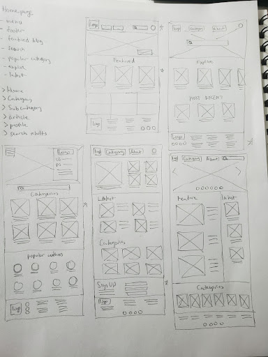
DIYscover is marketed as a one stop shop for all your DIY project ideas. Depending on the topic, the user range is large and it can encompass different types of people. To deal with such a large possible group, I want to focus on ease of navigation and clean layouts.
The users really appreciated the navigation and browsing experience of this website. They said that it was engaging and intuitive.
“I like the navigation and it shows on all the pages.”
- Participant
The biggest thing I learned was the importance to try new ideas and not go with the first one in mind. By doing that I was able to find a better and simpler solutions. This was especially helpful to get myself unstuck on a problem.
Current DIY sites are hard to navigate and don’t offer as much filtering options like most recent, popular, relevant, ect. A secondary issue is that the layout of the instruction pages are sometimes confusing as well.
Sept 2022 to Oct 2022
Design a DIY platform that is easy to browse both using categories and search bar. Also to create a better layout of the instructions pages for people to follow along.
UX researcher and ux designer
I conducted interviews and created a user journey map to understand the users I’m designing for and their needs. The primary user group identified through research were cosplayers or prop building enthusiasts who want to learn to build better props or costumes. This makes sense certain niche products are either not available for purchase or very expensive. They want to have access to quality instructions as well as ways to interact with the community and ask questions.
Josh is an amateur prop builder enthusiast who needs access to quality step-by-step instructions because he wants to build better fan made props.
Eleanor is an experienced gardener who needs an easy to use platform for gardening because she wants to connect with others in the community.
User flow:
I conducted a moderated usability study. The study was performed on 5 participants (each study) for 2--30 minutes. The main goal of both studies was to test it ease of navigation and article layout.
Most participants were confused about the many places to add comments on an article.
Most participants rather have text instructions instead of image gallery first.
Most participants did not notice or use the breadcrumb feature present on most pages.
Some participants felt having a save button when editing profile and settings is necessary.
This high-fidelity prototype is created with all the feedback in mind. The layout and browsing experience has been greatly improved.